Client Project · 2025
EduOda
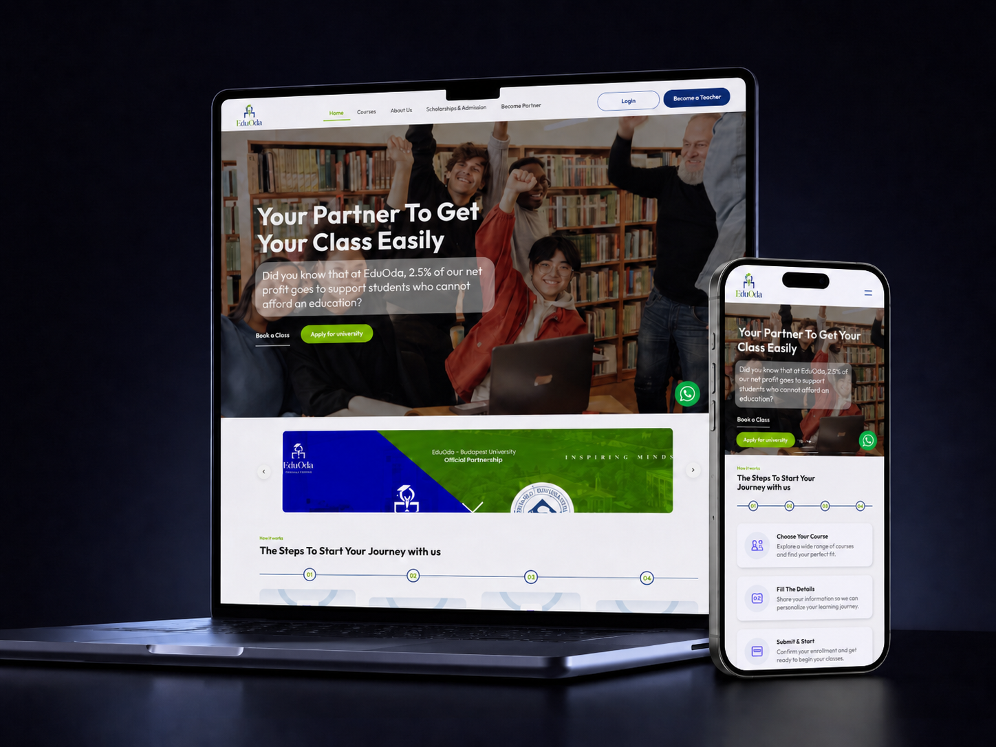
Designed the UX, UI, and prototype for EduOda to create a more structured, intuitive, and visually polished website that communicates the platform more clearly.
Overview
EduOda is an education-focused platform that needed its web presence to clearly communicate what it offers and who it’s for. The previous experience didn’t fully reflect the seriousness and quality of the platform — the goal was a more structured, professional site that gives visitors confidence from the first scroll.
The Challenge
Education products live or die on trust and clarity. Visitors need to understand what the platform does, who it’s built for, and why it’s worth their time — quickly and without friction. The existing flow buried key information and didn’t give the brand the visual weight it deserved.
Approach
UX work started with mapping the core user journeys and clarifying the message hierarchy on every page. Sections were restructured so the most important information leads, with supporting content layered beneath it in a logical reading order.
UI design then translated that structure into a calm, professional visual system — clean typography, generous whitespace, and a confident layout that lets the content speak. A high-fidelity prototype validated the full experience before handoff.
Outcome
A polished web experience that communicates EduOda’s value clearly, looks credible at a glance, and gives the team a stronger foundation to grow on.