Agency Project · 2025
Alwateen
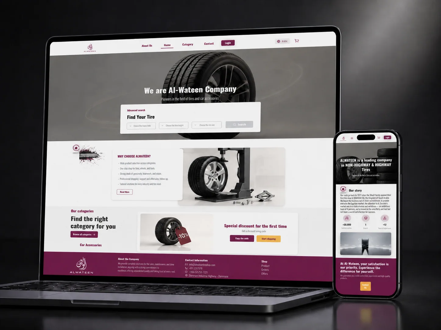
UX, UI and prototype for Alwateen, a Damascus-rooted highway, off-highway and two-wheeler tire company, a bilingual ecommerce experience built around finding the right tire by size first.
- Engagement
- Agency project, via Octopus
- Client
- Alwateen Trading
- Industry
- Automotive · Tire retail
- Location
- Damascus, Syria
- My Role
- UX Design · UI Design · Prototyping
- Deliverables
- Catalogue architecture · Wireframes · Bilingual UI system · High-fidelity prototype
- Platform
- Responsive web · Arabic & English
- Tools
- Figma
Overview
From a 1972 tire shop to a storefront that fits the whole catalogue.
Alwateen’s story starts with the Sherif family’s first tire shop in Damascus in 1972 and now spans highway, non-highway and two-wheeler tires plus accessories, with sales, maintenance and home installation. The company needed a digital storefront that matched that depth, for fleet buyers and professionals as much as for a driver replacing one tire.
Working through Octopus, the agency on the account, I designed the UX, the UI and a full prototype: a site that leads with the one thing every tire customer knows, their size, and wraps it in a brand that feels established, not improvised.
The challenge
Tire shopping is a decision, not a browse.
Size comes first
Nobody shops tires by scrolling. They know three numbers from the sidewall. The previous experience buried that behind categories.
Two languages, one system
The audience reads Arabic and English. Every layout had to survive right-to-left mirroring without becoming a second design.
Fleets and families
Transport fleets and construction sites buy differently from a private driver. The site needed B2B credibility and B2C ease in the same frame.
Process
Rethink the catalogue around how tires are actually bought.
- 01
Journey mapping
Traced the paths from “I need tires” to purchase or contact: by size, by category, by nearest center, by offer. Size won by a distance.
- 02
Catalogue architecture
Split the store into Tires and Accessories, defined the filter set, and designed the product card around the attributes that drive comparison.
- 03
Bilingual UI system
A plum-and-white palette with a warm amber accent for actions, condensed type for headlines, and every component checked in LTR and RTL.
- 04
Prototype & refinement
A clickable prototype of the full flow, search, catalogue, centers, offers, contact, reviewed with the client before handoff.
Trust before transaction
The company story earned its own page.
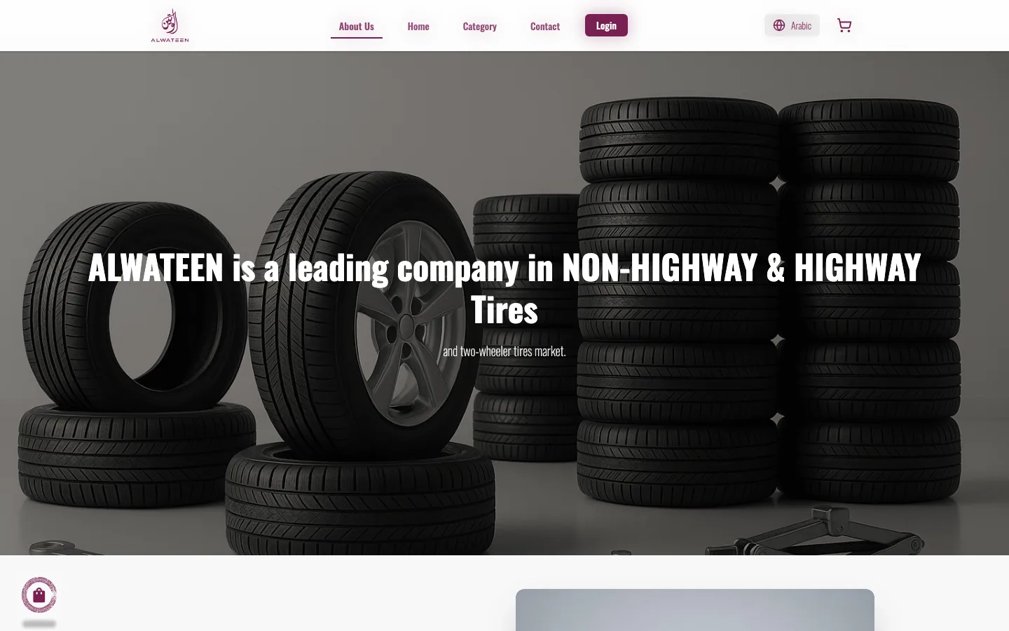
For a brand with half a century behind it, heritage is a selling point. The About page tells the 1972 story plainly, backs it with +50,000 customers and +12 years in the current market, and lists the four reasons professionals choose Alwateen: nationwide reach, expert support, premium global brands, and a track record with fleets.
The structure is deliberate: story, numbers, reasons, then a single “Contact Us” band. It reads as a company profile, which is exactly what a fleet buyer wants to see.
The design
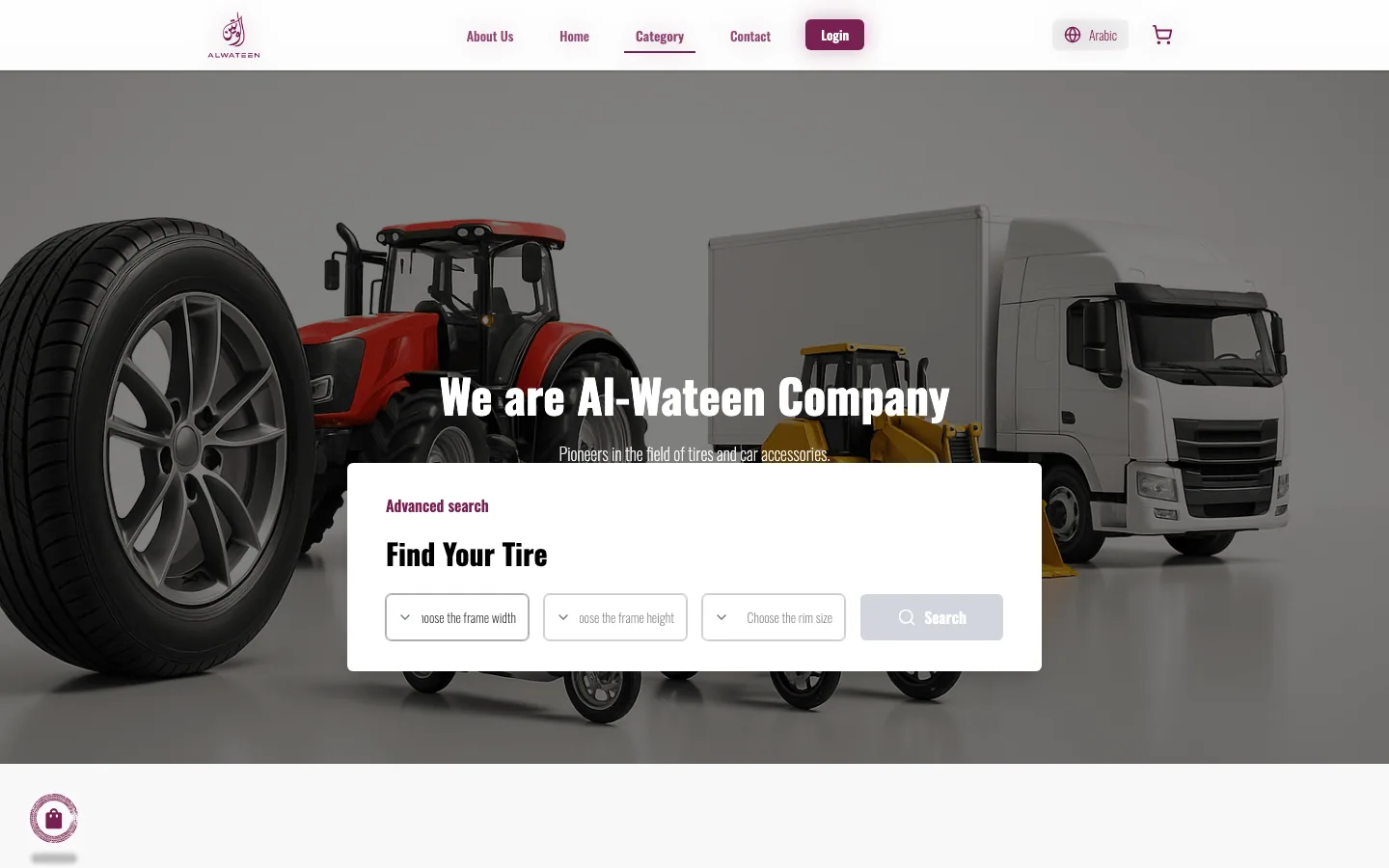
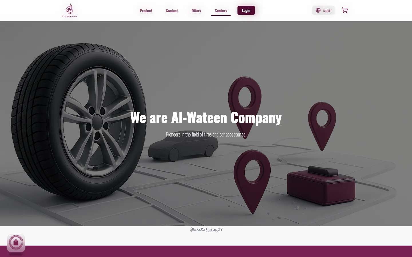
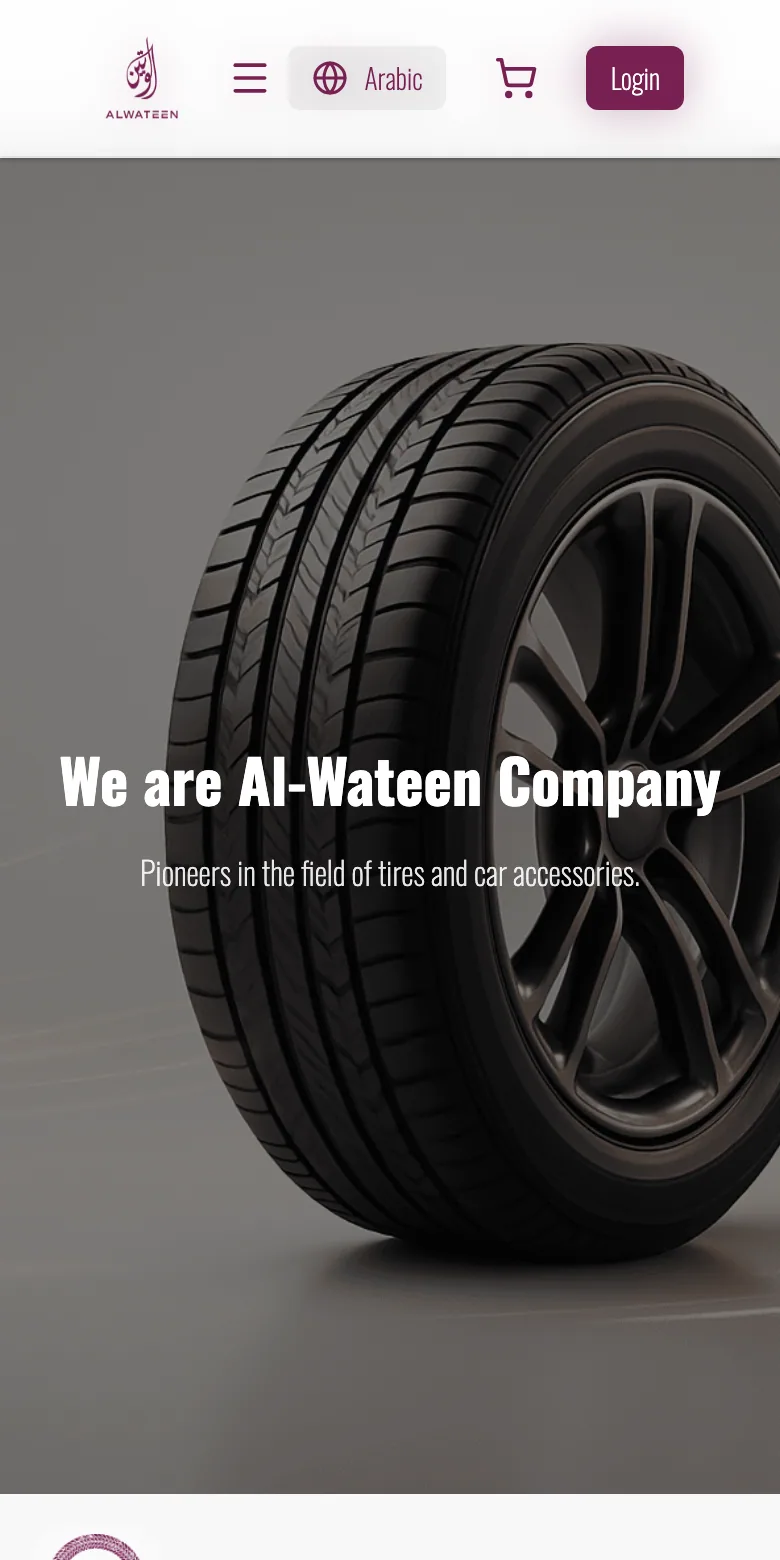
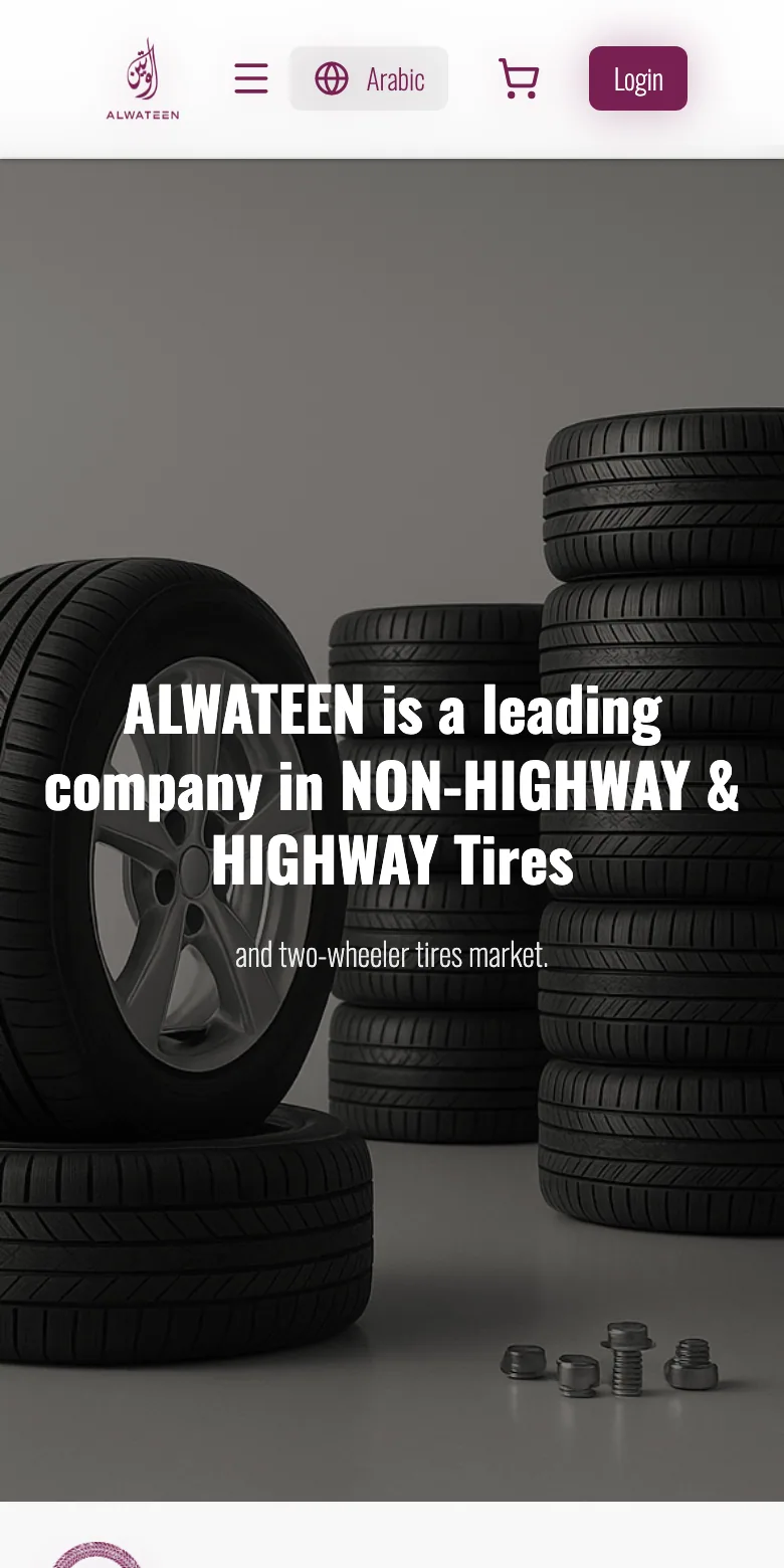
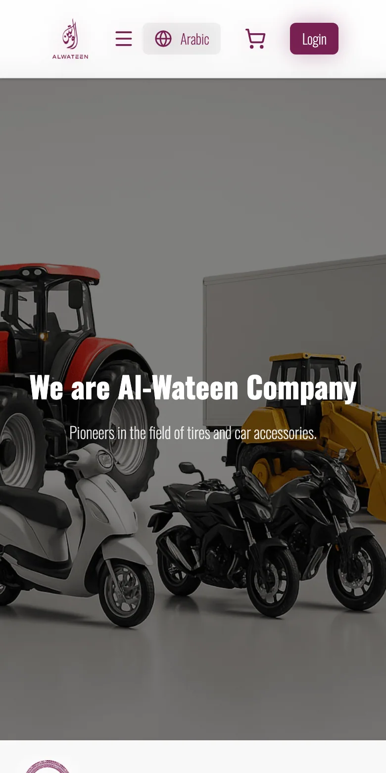
Catalogue, centers and contact, consistent from desktop to phone.
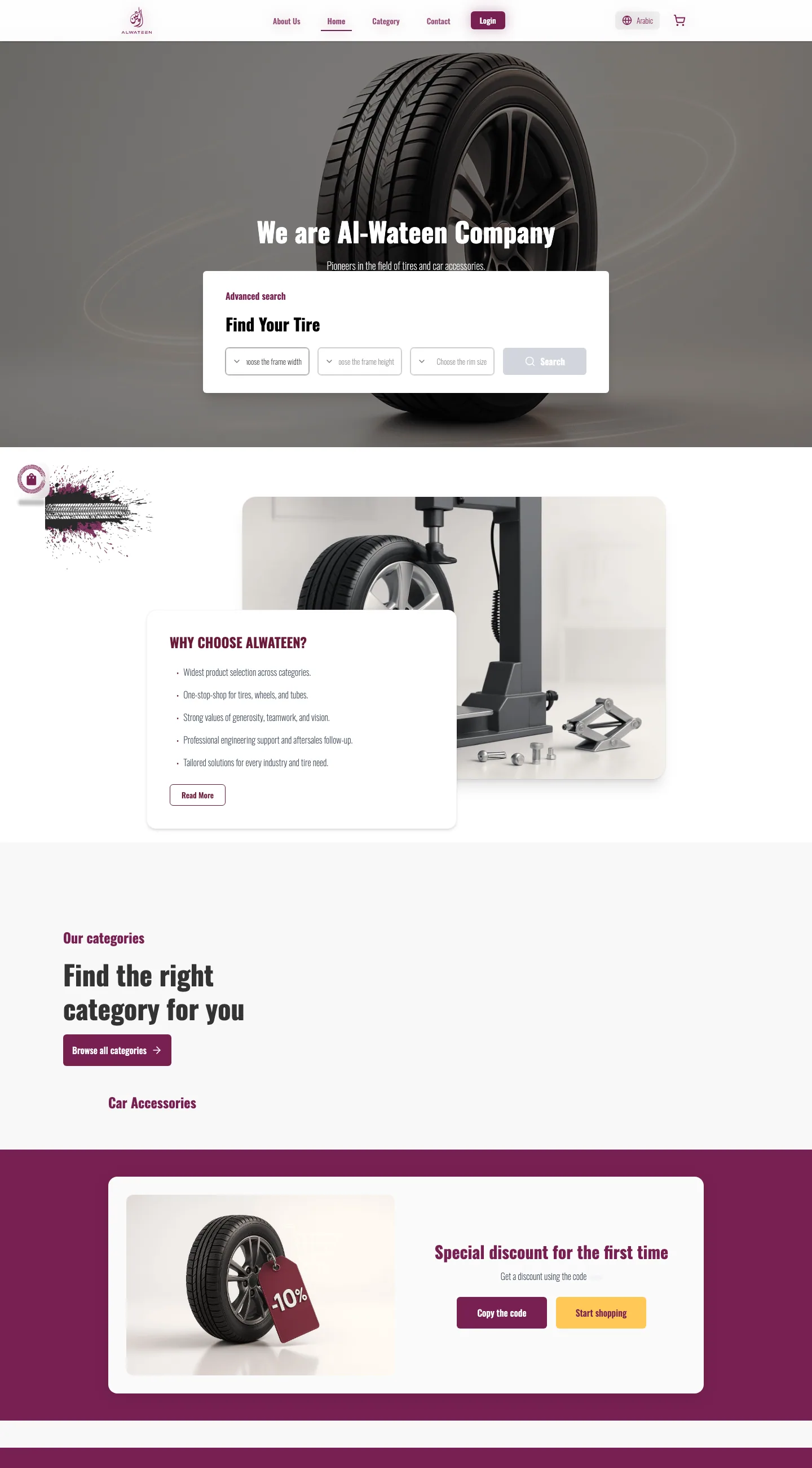
Every page shares the same hero language and the same card system, so the site feels like one place whether you arrive at the store, a service center map or the contact form.
Key decisions
What made the difference.
- 01
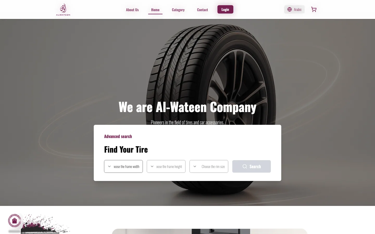
Search by size, above the fold
Frame width, frame height, rim size, Search, floating over the hero on the home page. The most common task became the first thing on screen.
- 02
Tires and accessories, separated
Two tabs at the top of the store keep the catalogue readable and the filters relevant, instead of one mixed grid.
- 03
Service centers as a destination
Installation and maintenance are half the business. Centers got a page with a map, not a line in the footer.
- 04
A first-order incentive
A “-10% for the first time” band with a copyable code turns a first visit into a first order without discounting the whole store.
At a glance
- 1972
- Roots in Damascus
- +50,000
- Satisfied customers
- +12
- Years of experience
- 2
- Languages, one design
“Ask for the three numbers on the sidewall, and the rest of the store designs itself.”
Design principle for Alwateen
